Climate alarmists are not credible. Also see Henrik Svensmark for a more credible theory of climate change.
----------------------------------------------------------
“If the facts don’t fit the theory, change the facts.”Einstein was just joking, but that is exactly what the Climategate team has done to the surface temperature record.
- Albert Einstein
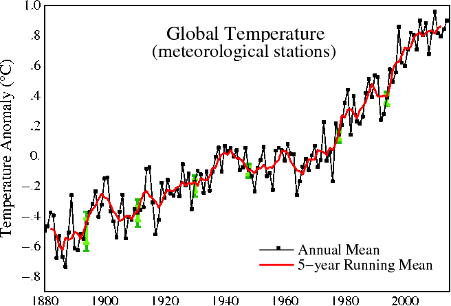
We have all grown used to seeing graphs like the one at above from NASA, showing nearly continuous global warming over the last 135 years – with a flat period between 1940 and 1980, and 1.2C warming from 1880 through 2000.
Much of climate science, journalism and public policy is based around the belief that these NASA graphs are an accurate representation of the temperature record, and that the apparent warming which is shown in the graphs is due to an increase in atmospheric CO2. It is therefore very important to understand the accuracy, consistency and integrity of these graphs.
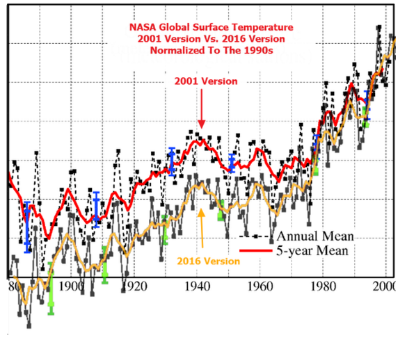
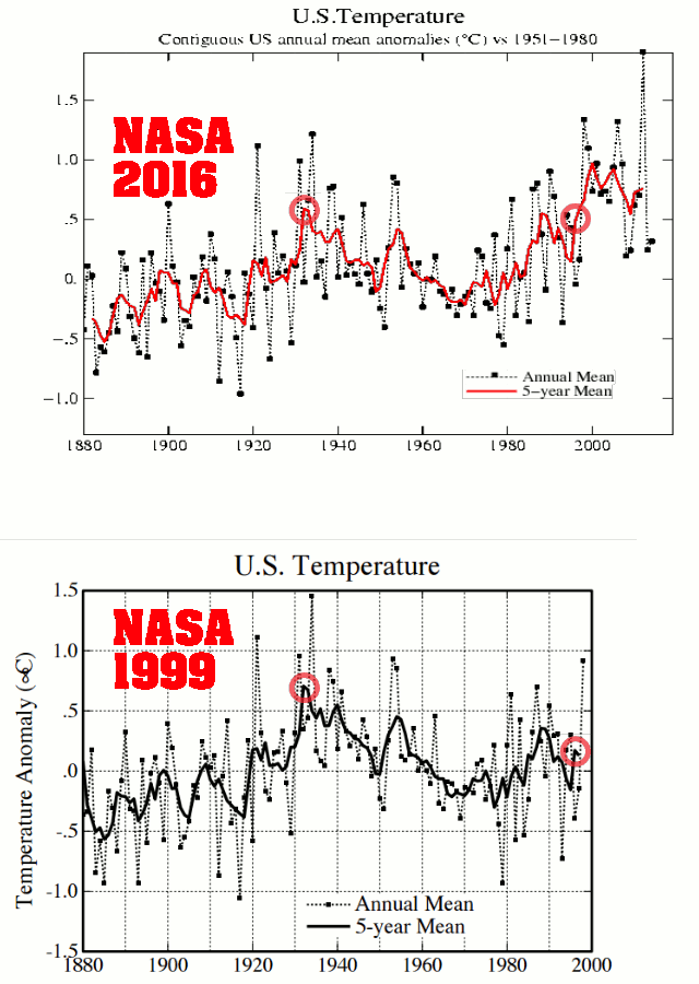
However, if we look at earlier versions of the same graph, we see something very different. The graph below was published by NASA in 2001, and showed 1975 as barely warmer than 1880 – with less than 0.6C warming from 1880 to 2000. The 2001 version showed only half as much warming from 1880 to 2000 as the 2016 version of the same graph above.
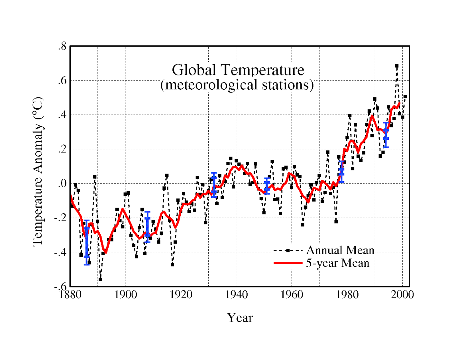
The recent increase of 0.6C in NASA’s reported warming over the 1880-2000 time period, is particularly troubling because the recent alterations extend far outside of their own error bars. The graph at right shows the 2001 version and the 2016 versions at the same scale, normalized to the most recent common decade. The blue lines represent the 2001 error bars, and the green lines represent the 2016 error bars. Note how the alterations are about three times as large as NASA’s reported error. This indicates a scientific process which is completely broken.
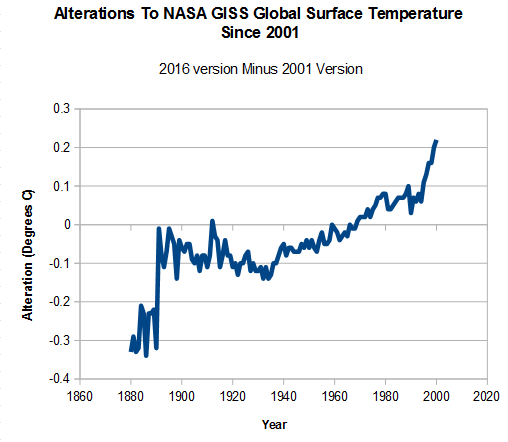
The graph below shows the changes which have been made to the NASA 1880-2000 temperature trend since 2001, a total of more than half a degree. The alterations have been almost as large as the entire trend reported in 2001, indicating a signal to noise ratio of close to zero. In other words, the NASA temperature graph is meaningless from a scientific point of view.
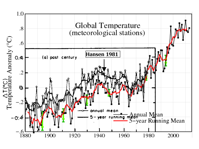
Going further back in time with published NASA temperature record, we see even larger discrepancies. NASA’s James Hansen in 1981 (below) showed a spike in temperatures around 1940, followed by nearly 0.3C cooling until the late 1960’s. This spike and cooling has been almost completely erased from the NASA temperature record.
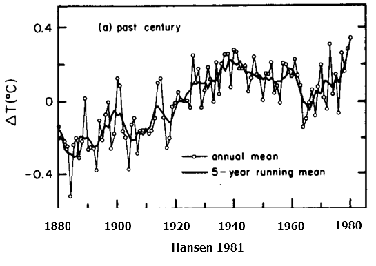
The image below overlays Hansen 1981 graph on the current NASA surface temperature record, and shows how pre-1980 temperatures have been cooled. By cooling the past, NASA increased the total amount of warming, removed the 1940’s spike, and removed the post 1940’s cooling.
These alterations did not occur all at once, but rather have occurred in successive stages, where the past is made cooler to create the appearance of more warming. The amount of warming from 1880 to 1980 has been doubled since Hansen 1981.
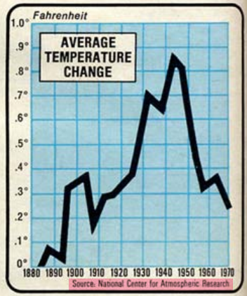
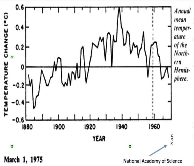
coolingworld.pdf Page 148 : understandingcli00unit.pdf
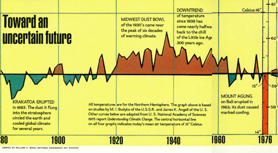
In 1974, the US Science Board reported a sharp cooling since World War II. The image below is from the November, 1976 issue of National Geographic
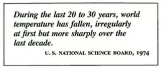
“Downward trend of temperature since 1938 has come nearly halfway back to the chill of the Little Ice Age 300 years ago”This downwards trend has been nearly erased by NASA and NOAA.
During the 1970s, the American Association For The Advancement of Science reported a global cooling trend since 1940 – as did Columbia University
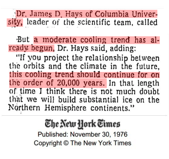

TimesMachine: November 30, 1976 4 Mar 1974, Page 1 – at Newspapers.com
In 1961 there was “unanimous agreement” among climate experts that Earth was getting colder. In 1979, the cooling was considered “indisputable” and NOAA reported about 1 degree F cooling since World War II
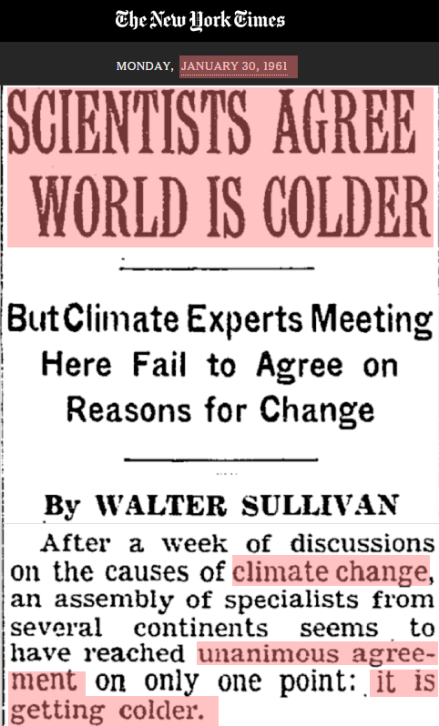
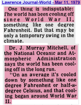
SCIENTISTS AGREE WORLD IS COLDER Lawrence Journal-World
The CIA warned that the cooling trend threatened political stability. The US and Russia mounted ‘large-scale investigations to determine why the Arctic climate is becoming more frigid” and the ice was getting thicker.
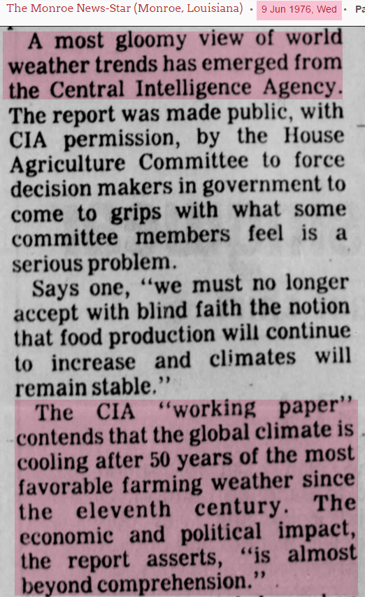
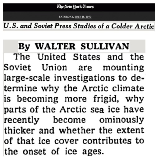
9 Jun 1976, Page 4 U.S. and Soviet Press Studies of a Colder Arctic;
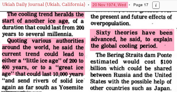
Sixty theories were put forward to explain the cooling
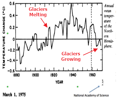
Further evidence for the cooling was that during the late 1950s and 1960s, glaciers were advancing for the first time in over a century.
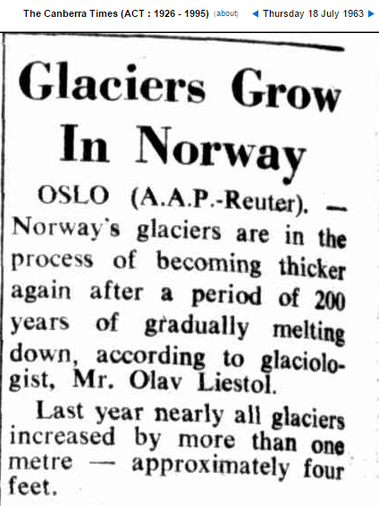
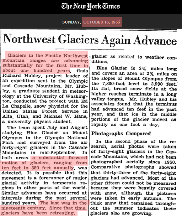
Glaciers Grow In Norway Northwest Glaciers Again Advance
This cooling was a big change from the previous decades. Glaciers were disappearing in the early part of the century, and many had vanished by 1923.
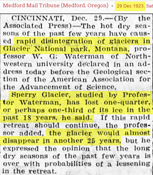
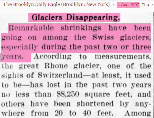
29 Dec 1923, Page 5 1 Aug 1907, Page 4
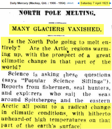
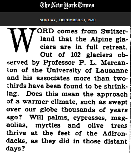
07 Apr 1923 Retreat of the Ice Rivers in the Alps
During the 1930s and 1940s, the glaciers of Norway and Greenland were rapidly melting and faced “catastrophic collapse.” By 1952 the glaciers of Norway and had lost half of their mass.
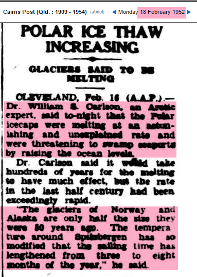

18 Feb 1952 17 Dec 1939, Page 15
National Geographic showed images of rapid glacial retreat in the Alps by 1940.


National Geographic : 1976 Nov, Page 594
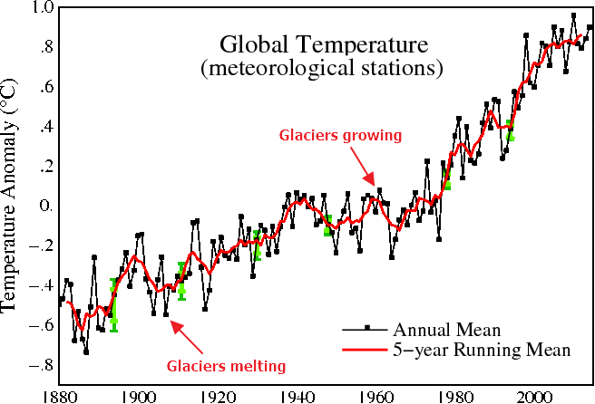
Evidence for the earlier warmth and post WWII cooling is very compelling . So why does it no longer appear in the NASA temperature record? NASA shows the period during the 1960s when glaciers growing as warm, and the earlier period when they were melting earlier as cold. The NASA temperature record does not appear consistent with the evidence on the ground, whereas the 1975 National Academy of Sciences graph is consistent.
This Climategate E-mail provides a big hint as to what has happened to the data since 1975. Climate scientists wanted to get rid of the “1940s blip”
From: Tom Wigley <wigley@ucar.edu>Removing the 1940s blip is exactly what NASA did. This is particularly evident in Greenland, Iceland and United States temperature data.
To: Phil Jones <p.jones@uea.ac.uk>
Subject: 1940s
Date: Sun, 27 Sep 2009 23:25:38 -0600
Cc: Ben Santer <santer1@llnl.gov>
So, if we could reduce the ocean blip by, say, 0.15 degC,
then this would be significant for the global mean — but
we’d still have to explain the land blip.
It would be good to remove at least part of the 1940s blip,
but we are still left with “why the blip”.
di2.nu/foia/1254108338.txt
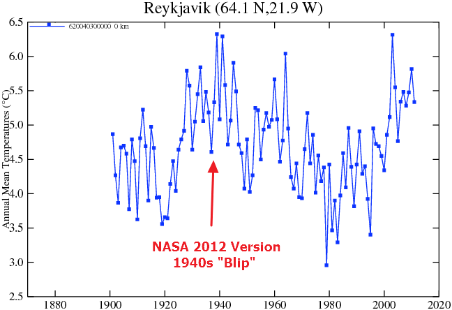
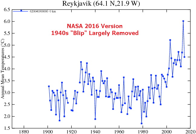
Data.GISS Data.GISS
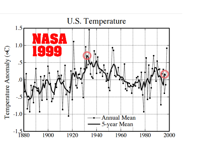
In 1999, NASA’s James Hansen reported that the US cooled half a degree since the 1930’s.
NASA now shows warming during that same period. NASA US temperature data is based on NOAA USHCN data, which is massively altered to create the appearance of warming.
pubs.giss.nasa.gov/docs/1999/1999_Hansen_etal_1.pdf
Whither U.S. Climate?
By James Hansen, Reto Ruedy, Jay Glascoe and Makiko Sato — August 1999
in the U.S. there has been little temperature change in the past 50 years, the time of rapidly increasing greenhouse gases — in fact, there was a slight cooling throughout much of the country (Figure 2)
NASA GISS: Science Briefs: Whither U.S. Climate?
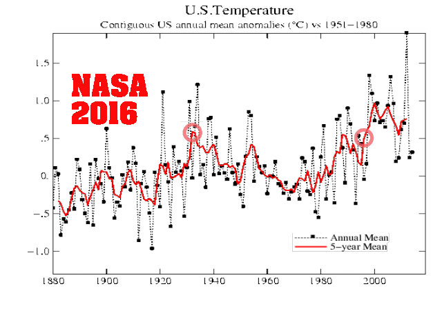
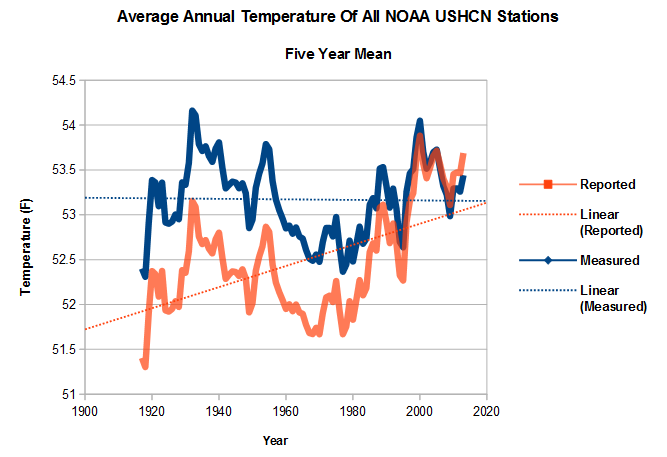
Fig.D.gif (525×438)The graph below shows how the NOAA data is altered. The blue line shows the averaged measured temperature at all USHCN stations, and the red line shows the average adjusted temperature. The warming trend over the last century is entirely due to “adjustments” by NOAA. Note how the “1940s blip” has been largely removed.
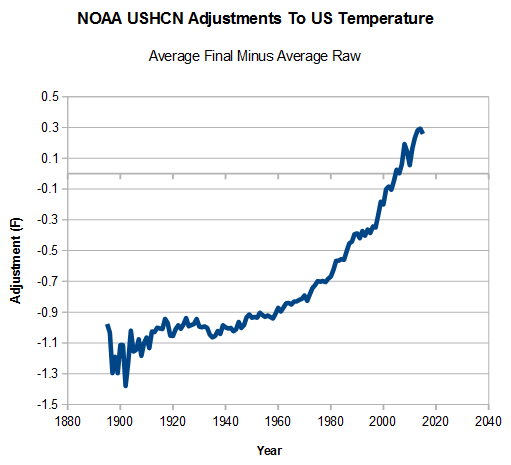
The image below shows the adjustments made by NOAA to the US temperature record – a total of 1.6 degrees F.
A large portion of these adjustments is due to NOAA simply making up data. If they are missing data at a particular station one month, they use a computer model to fabricate the temperature for that month. Since 1970, the percent of fabricated data has increased from 10% to almost half of the data. The US temperature record from NASA and NOAA is thus a completely meaningless fabrication, which bears no resemblance to the thermometer data it is derived from.
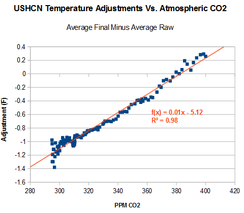
The data has been adjusted to match the increase in carbon dioxide. In other words, it is being forced to fit to greenhouse gas theory.
In summary, the NASA global and US temperature records are neither accurate, nor credible representations of reality.
“With four parameters I can fit an elephant, and with five I can make him wiggle his trunk”
- John von Neumann

No comments:
Post a Comment